Bob Ross - Joy of Painting
Jonathan Bouchet
2021-10-05
bob_ross.RmdThis vignette is based on 538 study : A statistical analysis of the work of Bob Ross. Bob Ross was an american painter and host of the The Joy of Painting, an instructional television program that aired from 1983 to 1994 on PBS in the United States.
Load required packages to reproduce analysis as well as the dataset.
library(fivethirtyeight)
library(ggplot2)
library(dplyr)
library(tibble)
library(tidyr)
library(ggthemes)
library(knitr)
library(corrplot)
library(ggraph)
library(igraph)
Data explanation and cleaning
The author of the article (W. Hickey) went through all Bob Ross’s paintings and coded the describing elements (trees, water, mountain, etc …) : when an element is present in a painting, it is encoding by 1 in the relevant column. He wasn’t able to analyze 3 paintings. There are also 2 episodes having the same title, so one of them is renamed to avoid errors during a group_by episode. In addition, there are 22 episodes where Bob Ross did not paint.
df <- bob_ross
#define incomplete paintings
incomplete <-c("PURPLE MOUNTAIN RANGE","COUNTRY CHARM","PEACEFUL REFLECTIONS")
df <- df %>% filter(guest==0 & !(title %in% incomplete))
#check the 2 episodes with same name
#df %>% filter(title=="LAKESIDE CABIN")
df[df$episode=='S08E02','title']<-'LAKESIDE CABIN 2'
After removing the missing paintings, the dataframe consists of 66 features describing 378 paintings.
Given the structure of the dataframe :
##Study by Features
- a
colSumcan provide the total number and percentage (tot,featurePercentage) of features through all the paintings as well as their frequency(featureFreq). - a
rowSumcan provide the distribution of features present per painting.
Frequency
#calculate the colSums for numeric columns and transpose the result
temp <- as.data.frame(df %>%
                        select(-episode, -season, -episode_num ,-title) %>%
                        summarise_all(funs(sum)) %>% t())
## Warning: `funs()` was deprecated in dplyr 0.8.0.
## Please use a list of either functions or lambdas:
##
## # Simple named list:
## list(mean = mean, median = median)
##
## # Auto named with `tibble::lst()`:
## tibble::lst(mean, median)
##
## # Using lambdas
## list(~ mean(., trim = .2), ~ median(., na.rm = TRUE))
#rename,switch columns and calculate percentage over all paintings and frequency though all episodes
per_features <- temp %>% rownames_to_column() %>%
  select(feature=rowname, tot = V1) %>%
  mutate(
    feature_percentage = (tot / sum(tot))*100,
    feature_percentage_Label = paste0(round(feature_percentage,1),"%"),
    feature_freq = tot/ nrow(df)*100,
    feature_freq_label = paste0(round(feature_freq,1),"%"))
feature_freq_cut <- 10 #10% most present features
ggplot(data=filter(per_features,feature_freq>feature_freq_cut), aes(x=reorder(feature,feature_freq),y=feature_freq)) +
  geom_bar(stat='identity') + geom_text(aes(label=feature_freq_label), position=position_dodge(width=0.9), vjust=.5,hjust=0,size=2.5,color='red') +
  coord_flip() +
  theme_fivethirtyeight() +
  ggtitle('Features\'s appearance(%) through all episodes')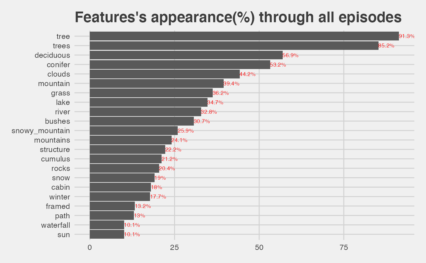
-
treeandtreesfeatures appear in more than 90% of all the paintings.
Correlation
Since a row with no entries causes a standard deviation = 0, features are selected based on their number.
#find features present
top<-c(per_features %>% filter(tot>1) %>% arrange(-tot) %>% select(feature))
num_data<-df %>% select_(.dots = top$feature)
## Warning: `select_()` was deprecated in dplyr 0.7.0.
## Please use `select()` instead.
num_cols <- sapply(num_data, is.numeric)
corrplot(cor(num_data[,num_cols]), method='square',order="AOE")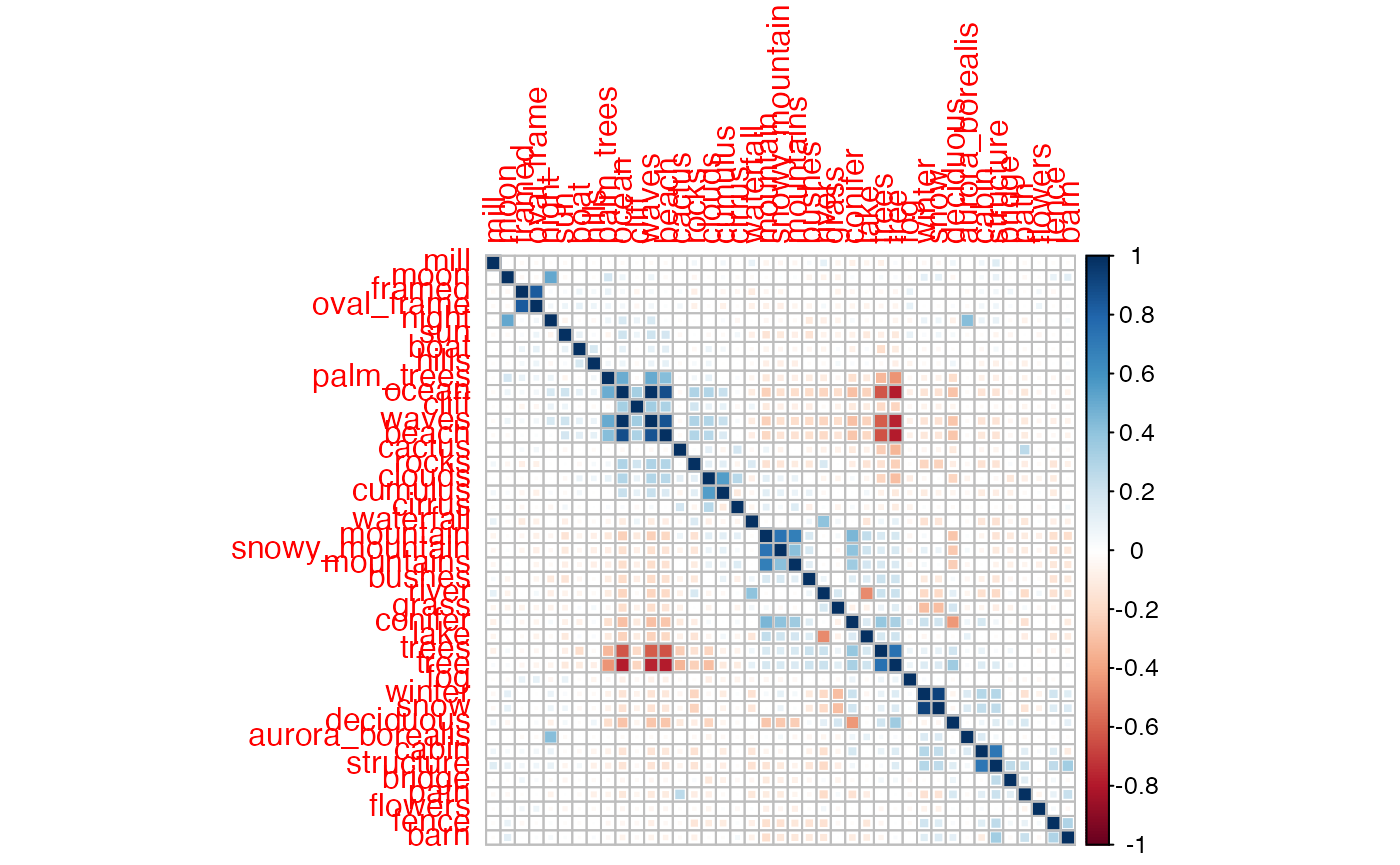
- we see positive correlation for the expected cases, like
tree/trees, ornight/moon - we also see negative correlation for features totally different, such as
waves/tree - a negative correlation means that as one of the variables increases, the other tends to decrease, and vice versa, so it makes sense to find an anti-correlation in the case
waves/treefor example.
Study by Episodes
Episodes having the greatest number of features
per_episode <- df %>%
  select(-episode,-season,-episode_num ,-title) %>%
  select_if(is.numeric) %>%
  mutate(episode=1:n()) %>%
  gather(item, count, -episode) %>%
  group_by(episode) %>%
  summarise(sum = sum(count)) %>%
  arrange(-sum)

#select a cut
cut_features<-11
ggplot(data=filter(per_episode,sum>cut_features), aes(x=reorder(episode,sum),y=sum)) +
  geom_bar(stat='identity') +
  coord_flip() + theme_fivethirtyeight() +
  ggtitle(paste0('Paintings having more than ', cut_features,' features'))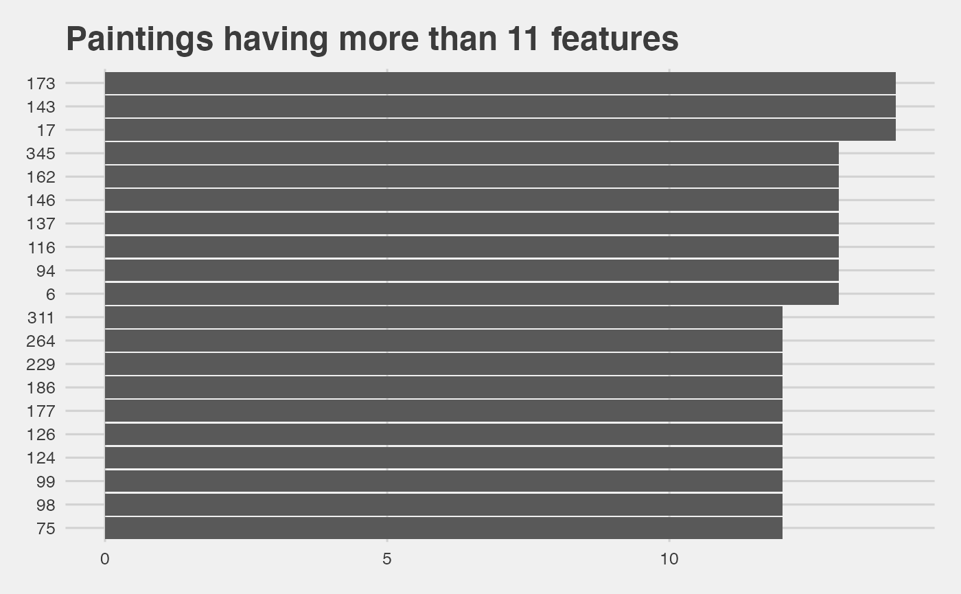
Episodes distribution vs. their number of features
per_episode_summary <- per_episode %>%
  group_by(sum) %>%
  summarise(tot_features=n()) %>%
  mutate(
    percent = (tot_features/ sum(tot_features))*100,
    label = paste0(round(percent,1),"%"))

ggplot(data=per_episode_summary, aes(x=sum,y=tot_features)) +
  geom_bar(stat='identity') +
  geom_text(aes(label=label), position=position_dodge(width=0.9), vjust=-1,hjust=.5,size=2.5,color='red')+
  theme_fivethirtyeight() + ggtitle('Distribution of paitings vs. \n number of features')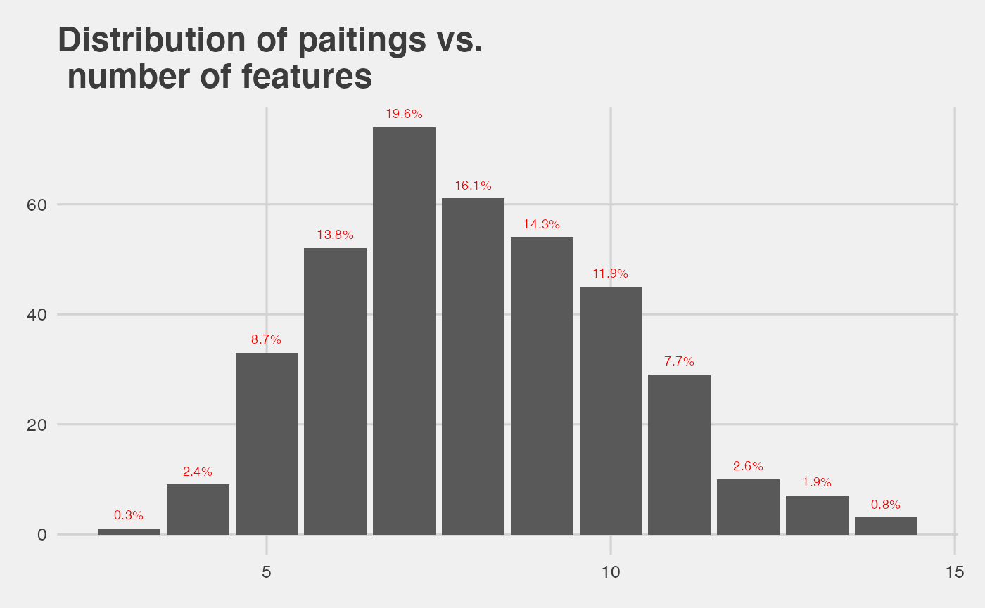
- the mean number of features among all paintings is:
mean(per_episode$sum)## [1] 8.015873Network analysis
Motivation
To further study the features’s correlation, a network analysis can be performed. In this case, for each painting an object feature_i, feature_j is built where i,j are indexes for a given painting. The ggraph package takes as input a dataframe with 2 columns and makes a graph network based on these 2 columns. The function below loops over all features in a given painting and make the graph connections.
#function to loop an array of X features and return a DF with feature_1 | feature_2
make_connection<-function(x){
    feature_1<-c()
    feature_2<-c()
    cnt<-1
    for(i in 1:(nrow(x)-1)){
        for(j in (i+1):(nrow(x))){
            feature_1[cnt]<-(x[i,1])
            feature_2[cnt]<-(x[j,1])
            cnt<-cnt+1
            }
    }
    res<-data.frame("feature_1"=feature_1,"feature_2"=feature_2)
    return(res)
}
Result with all paintings for the first season
#create empty DF to store the results
season_1 <- df %>% filter(season==1)

#empty dataframe to save all the connections
season1_res <- data.frame("feature_1"= character(),"feature_2"=character())

#loop over paintings in season 1
for(i in 1:nrow(season_1)){
    #select features of ith painting and make a dataframe
    temp <- as.data.frame(season_1 %>% select(-episode, -season, -episode_num ,-title) %>% slice(i) %>% t())
    pos_data <- temp %>% rownames_to_column() %>% select(feature=rowname, number = V1) %>% filter(number>0)
    res<-make_connection(pos_data)
    season1_res<-rbind(season1_res,res)
}
The interesting thing is that we can apply some weights to the graph. The weights are based on the frequency of the connection between 2 features.
## `summarise()` has grouped output by 'feature_1'. You can override using the `.groups` argument.
colnames(graph_s1)[3]<-'weight'

g1<-graph.data.frame(graph_s1)
ggraph(g1,layout='circle') +
  geom_edge_fan(aes(width=E(g1)$weight),alpha=.25,show.legend = FALSE) +
  geom_node_point(size=6,color="red",alpha=1) +
  geom_node_text(aes(label = name)) + theme_fivethirtyeight() + ggtitle('Features network of all paintings of season 1')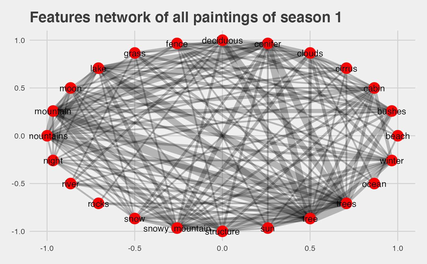
- larger width indicate the frequency of this correlation
- the most frequent connection are
tree | trees,tree | lake,lake | mountain, which makes sense as seen with the correlation plot.